Designing AgriTech Apps to Drive Crop Production
Overview
Ricult, a digital financial solution for smallholder farmers, offers an AgriTech mobile application that helps agronomists and field agents from mills to monitor farms and increase crop yields, benefiting everyone in the supply chain. To create a more modern, user-friendly product, Ricult wanted to migrate from their original application to a new design.
Our Solution
Working alongside our UX designers, our UX Research team collaborated with Ricult and the mills in Ricult’s network to identify features that the app’s users needed to better monitor crops and simplify their jobs. We conducted extensive UX research and in-depth interviews in order to assess the mobile app’s real-life applications, the demands from mills and farmers, and any issues with user flow. We also provided usability testing for prototypes in three languages.
Our UX Researchers then used these insights to help our UX Design and Riucult’s outsourced developers create a digital product that truly answers the needs of Ricult’s stakeholders.
Identified issues affecting 70% of users
Through our remote usability testing, we ensured that the app is user-friendly, intuitive, and applicable to real-life use |
Validated mobile application UX in 3 countriesWe performed UX research with users in Thailand, Pakistan and Vietnam through online testing sessions
|
Matched the needs of hundreds of field agentsBy conducting interviews with actual local users, we ensured the app met the unique needs of various agents in Ricult’s network. |
|---|
" Despite the specialized nature of our product, Seven Peaks showed a strong understanding and actively engaged in research to deeply grasp our users' challenges. Morphosis was remarkably flexible, readily adapting to our team's requirements and project shifts whenever necessary."
Renier Bueno, Ricult
Global Head of Product Management
Our process
Design discovery → Value proposition → Information architecture → In-depth user interviews → Wireframing → Discussion guides → Usability testing
Our design discovery started with in-person stakeholder interviews and workshops with the field agents who would be inspecting and collecting information about the farms. This helped determine what features were already included in the old app that could be migrated over, and what additional features the agents, supervisors, and our client each wanted.
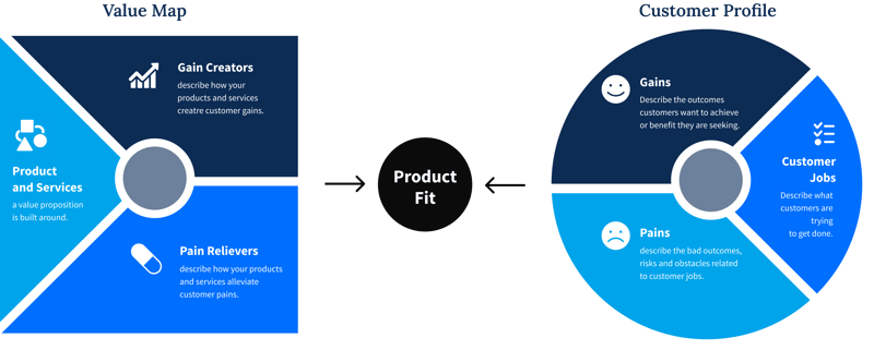
Our UX researchers then teamed up with our UX designers to put together a value proposition. In this stage, we built a customer profile by identifying the jobs, pains, and potential gains of the agents. This was followed by an ideation process to determine how we could help, through products and services, pain relievers, and gain creators.

Once we determined which features would most benefit users and eliminate their frustrations, our UX designers and UX researchers collaborated to build the app’s sitemap.
However, before our designers could progress to the next step and begin creating wireframes, our UX team needed to verify that the business assumptions made during the value proposition accurately reflected the users’ real-life needs. Therefore, we conducted in-depth, one-on-one interviews with users at mills to pinpoint issues before our team started designing.
Furthermore, during the design process for wireframes, our UX researchers attended daily standups with our UX Designers, in order to review each development process with representatives of Ricult. This ensured that designs aligned with Ricult’s business goals and with the pain points of users, resulting in a viable, impactful final product.
Leading up to the app’s usability testing, our UX Researchers drafted discussion guides. This outlined not only the questions to ask users during the testing process, but also generated possible scenarios that could arise from testing the app. We then applied those discussion guides to testing the app with real users in order to determine any remaining areas of the UX design that needed to be changed or fixed.

Challenges we overcame
1. Collecting user insights from multiple countries
Ricult wanted to deploy their AgriTech mobile application for mills in Thailand, Pakistan and Vietnam. In order to perform usability testing on agents working in multiple provinces in three different countries, we carried out our validation process online.
We invited local Ricult representatives, mill supervisors, and field agents to join online meetings to perform usability testing. During each test, we sent our participants a link to our wireframes, localized to the user’s language. By asking the users to share their screen, we were able to observe their on-screen journey through the app, while studying their behavior and reactions. This allowed us to collect insights from target users in each country.
2. Avoiding blocks in recording crop yield
Our UX research revealed that the standards for measuring crop production are not the same for each mill, especially for different crops.
While sweetcorn can be measured right at the time of harvest, the yield of a sugarcane can only be measured once the crop has been processed and turned into sugar. However, in the app’s initial design, crop yield had to be measured at the time the crop harvesting was recorded in the app. This meant that agents working with sugarcane were unable to record information, and were unable to proceed to the next processes on the application.
Without our in-depth usability testing, our UX design team and our clients would not have foreseen this problem with the app’s functionality, and it is very likely that this would have resulted in blocks and dead ends in user flows.
3. Increasing accessibility to crop health data
Ricult’s app displays crop health gathered from satellite data, which is instrumental to helping monitor farms and fields for productivity and for identifying risks. However, at least 50% of the field agents using the app did not understand the acronym Ricult used to refer to the crop health index, NDVI (Normalized Difference Vegetation Index).
We helped make this data integration more intuitive for users by altering the crop health index to ‘Health’. This allows field agents to better understand the satellite data on each farm, which then enables them to better support farmers in their crop production.


