Removing the Friction for Advanced Trading
Overview
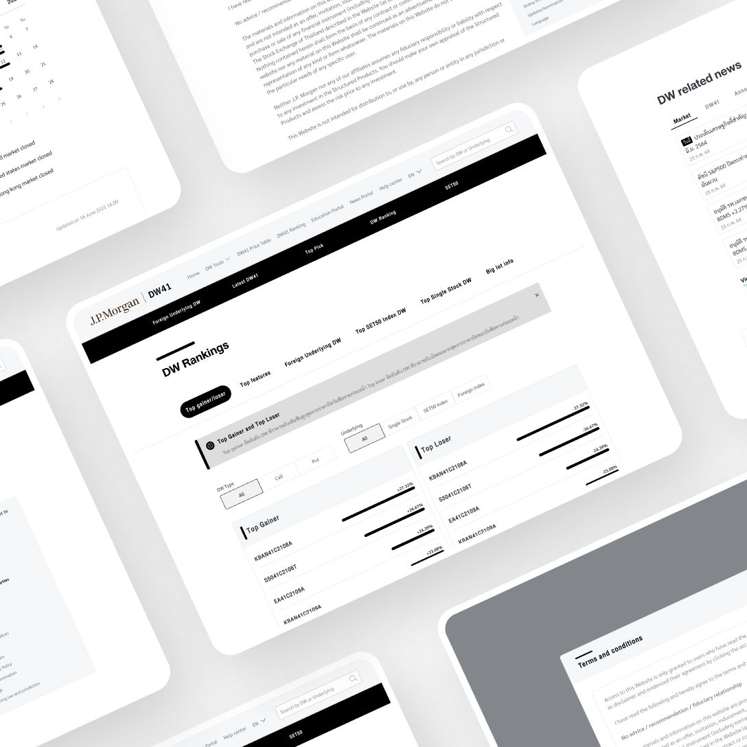
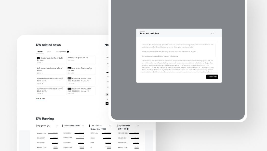
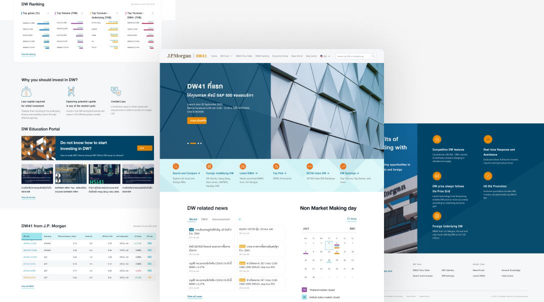
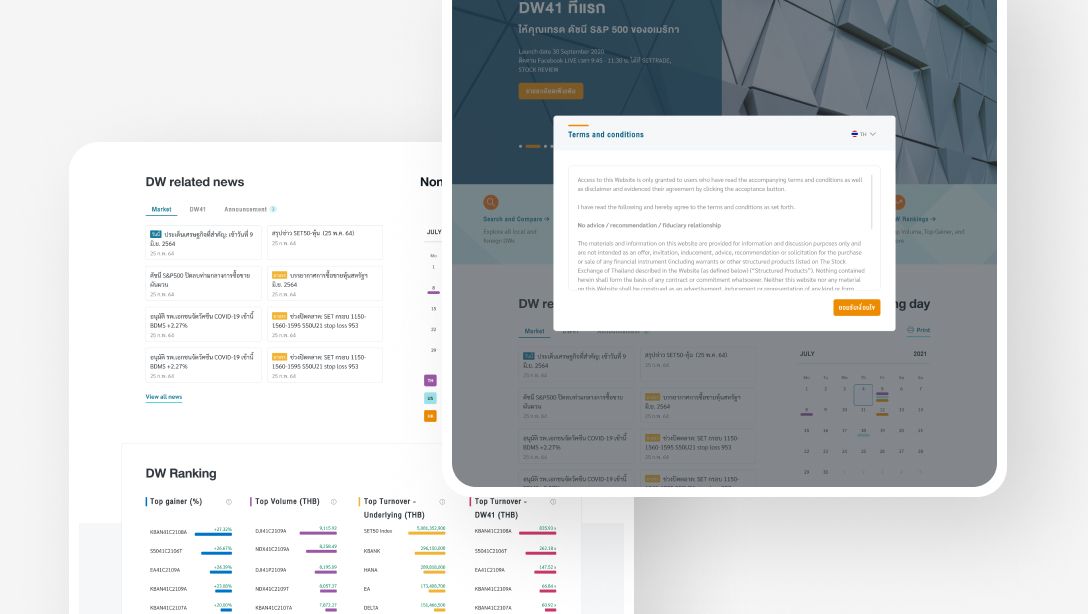
J.P. Morgan felt that their website for derivative warrant (DW) traders was cluttered and hard to navigate. As a result, users struggled to complete tasks on the site or weren't aware of the company’s complete offerings. This may have also caused some users to leave for competitors' products. With a comprehensive UX/UI and platform design revamp, advanced trading instruments such as DW’s became more accessible for a wider range of users, including retail traders. These improvements proved to be essential for retail traders to gain usability for J.P.Morgan's platform, resulting in greater access and reach for their products.
Our solution
We determined the needs of both new and experienced DW traders through research and by running usability tests on prototypes. After studying the feedback, we iterated new designs and streamlined the workflows used to perform tasks.
In the end, our team created a first-class website for traders of all skill levels thanks to the valuable input of our research participants.
Usability metrics definedDefined usability metrics to judge the success of designs for all users. |
Streamlined user flows for greater UXDecluttered the application and streamlined flows which helped elevate the app's user experience. |
User-tested prototypesDesigned and tested numerous prototypes to ensure digital product success at launch. |
|---|

Our process
Determining user needs → Usability testing → Feedback gathering → Design iteration
During the research phase of this project, our goal was to find out what DW traders want out of the J.P. Morgan DW trading platform, how they navigate it, their experience of it, and their proficiency level.
As DW trading is a specialized field, Seven Peaks’s research team decided to include traders of varying proficiency levels in our research - spanning from retail traders to institutional. We chose five participants to give us an idea of how a variety of users interact with the website.
Our process was this: we determined user needs through research, conducted usability tests via prototyping with DW traders, acquired and studied feedback, and iterated new designs from this data.


Research, methodology, and objectives
To get a clearer picture of the site's users, we grouped users based on their DW trading proficiency. The three skill groups were novice, average, and sophisticated users. Through our research, we were able to create a comprehensive prototype DW trading platform, capable of serving the needs of all levels of proficiency.
We observed each group’s pain points, struggles, and how they handled user flows, which helped us fine-tune the user interface. We then created a prototype for the DW site, and our developers used logging software to observe the five participants.
The data we collected formed the basis of how we defined usability and determined which site elements needed to be changed or fixed. It also showed us what the average DW trader wants to see on J.P. Morgan’s trading platform.
Challenges we overcame
1. Defining usability
In order to set a usability standard, we needed to define usability in this context. Given the site and its users, here’s how we defined it:
- Learnability: how easily can a first-time user accomplish a task for the first time?
- Efficiency: how quickly can a user finish a task?
- Errors: how often does a user make a mistake? How serious is the mistake? And how quickly do they recover from it?
- Satisfaction: how pleasant is the design to use?
We established these metrics in the early stages of the research, allowing us to create a user interface that met J.P. Morgan’s standards for its customers.
2. User experience
One challenge that J.P. Morgan faced was that their old website was hard to understand and navigate, which made it hard for people to understand the content or what J.P. Morgan was offering.
Our research gave us the data we needed to create a workable solution for the user interface and streamline the workflows that our participants used to perform tasks.
Including research participants of varying skills provided us with enough feedback to create a DW trading site that would work for not only experts but also people just getting into it.
3. Miscellaneous challenges
Our participants brought some challenges to our attention that didn’t fit into a specific category. We looked into them and discovered that they were all minor issues. Our developers addressed them based on how they affect the user experience.
After asking our research participants for more information, we implemented simple fixes, such as tidying up the user interface further.
While minor issues don’t have a big impact on the user experience, solving them goes a long way toward preventing future issues.


With the end-result enhancing usability for all levels of traders and not just institutional-grade users, J.P.Morgan's world-class trading platform was able to significantly increase its reach to encompass the average retail trader. Derivative Warrants, which are highly advanced financial instruments that provide greater opportunities and possibilities for trading, coupled with valuable informational and educational content, ultimately enable more people of all levels to benefit from having access to better tools and financial technology.
To explore how our experts in digital products and design can improve financial inclusion for your enterprise, don't hesitate to speak with one of our consultants today.
.webp?width=1200&height=1200&name=SPS_Case%20Study_Ricult_sq%20(Blue).webp)

